Because the work of the California Community Colleges involves many different sectors, it is essential that the Chancellor's Office ensures a consistent brand across all projects. This consistency helps to reinforce trust and positive perceptions of Chancellor's Office work across the system.
These guidelines bring together many of the key components necessary to accurately brand third-party tools and platforms used on behalf of the Chancellor's Office.
Logo and Usage Placement
The logo is the primary means of establishing the California Community Colleges brand and lets users know they are interacting with an approved tool.
- Whenever possible, the California Community Colleges logo or appropriate territory logo should appear in the upper left corner of the page
- This logo should appear as full color on the white background or as a white on a dark blue background. See Color Palette and Usage below for more information about color.
- If using the primary California Community Colleges logo, make sure the lockup fits the available space. For example, use the horizontal lockup for wider spaces and the stacked lockup for more square spaces.
- If the logo appears blurry, please contact brand@cccco.edu for assistance or to obtain a higher resolution logo file.

Color Palette and Usage
Whenever a tool permits changing its color palette, it should be changed to match the California Community Colleges palette as closely as possible.
- If there is a color picker available, use the RGB or hex values in the California Community Colleges palette to get an exact match
- If there are only predefined colors available, use your best judgement to match the CCC palette as closely as possible
- The primary brand color is Dark Blue (RGB 0 / 47 / 109; Hex #002F6D). If only one custom color is allowed, please use Dark Blue
- If further custom colors are possible, they should be in the following order:
- Dark Blue (RGB 0 / 47 / 109; Hex #002F6D)
- Dark Grey (RGB 85 / 87 / 89; Hex #555759)
- Medium Blue (RGB 0 / 102 / 186; Hex #0066BA)
- Gold (RGB 255 / 182 / 0; Hex #FFB600)
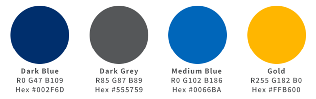
- Titles should be Dark Blue and text should be Dark Gray.
- Gold is an accent color and should never be used for text of any kind, nor as a background color for any text
- If the option is available, buttons should be made Dark Blue or Medium Blue with white text
Imagery
In general, avoid stock photography or graphics and instead focus on images of real California Community College students and campuses. If you need assistance finding appropriate images, please contact brand@cccco.edu.

 A group of California Community College students collaborating with each other

 Implies collaboration but is overly stylized and not specific to the college
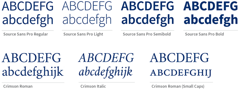
Typefaces and Substitutes
Source Sans and Crimson are the primary brand typefaces. They are open and free to download, but some online tools may not allow custom fonts to be uploaded and may not have these exact typefaces available to choose from. Because available fonts differ from tool to tool, please contact brand@cccco,edu for assistance selecting a substitute.